CSS Button Hover Effects: 20 Examples With Code
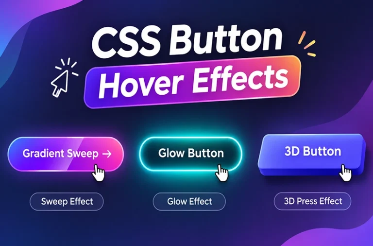
CSS button hover effects are a simple way to make website buttons more interactive and attractive. When someone moves their mouse over a button, you can change its colour, size, shadow, border or position using CSS.
A good hover effect makes a button feel responsive and helps visitors understand which elements they can interact with.
In this guide, we’ll explore 20 CSS button hover effects with live previews and code examples. You can try each effect, copy the CSS and use it in your own website projects.
Whether you’re building a landing page, portfolio, online store or business website, these button hover effects can help improve your website’s user interface.
20 CSS Button Hover Effects
Try all 20 CSS button hover effects below. Move your mouse over each button to see its animation, and click the Copy CSS button to get the code. You can use these examples in your own HTML and CSS projects.
1. Colour change
01 / 20Change the button background colour when a visitor hovers over it.
2. Slide from left
02 / 20A dark background slides in from the left side of the button.
3. Slide from bottom
03 / 20A background layer moves upward to fill the button.
4. Grow on hover
04 / 20Make the button slightly larger for a simple interactive feel.
5. Shrink on hover
05 / 20A small scale-down effect gives the button a pressed feel.
6. Lift with shadow
06 / 20Move the button upward and add a soft shadow.
7. Soft glow
07 / 20Add a blue glow around the button on hover.
8. Underline reveal
08 / 20Reveal a thin underline that grows from the centre.
9. Outline reveal
09 / 20Use a transparent button with an outline that animates into place.
10. Gradient shift
10 / 20Move a multi-colour gradient when the button is hovered.
11. Shine effect
11 / 20A light streak travels across the button surface.
12. Ripple effect
12 / 20A soft circle expands from the centre of the button.
13. Bounce
13 / 20Give the button a quick bounce animation.
14. Rotate
14 / 20Rotate the button slightly for a playful interaction.
15. 3D press
15 / 20Move the button down and reduce its shadow to create a pressed look.
16. Skew
16 / 20Skew the button slightly as the pointer moves over it.
17. Arrow reveal
17 / 20Reveal an arrow beside the button label on hover.
18. Split background
18 / 20Two background panels slide in from opposite sides.
19. Neon glow
19 / 20Increase the cyan glow for a neon-inspired button.
20. Pulse
20 / 20Add a repeating pulse to draw attention to an important action.
Hover over each button to preview the effect. Select “Copy CSS” to copy its code.
If you need to show more than one screen at once, this three phone screen mockup is a great option.
The scene has three smartphones arranged across a dark platform with a series of lines running underneath them. The blue screen treatment gives the mockup a modern, tech-focused look without making the scene too complicated.
You could use the three devices to show different screens from the same app, an onboarding flow, a few key features or different stages of a UI design.
It’s also a good choice when you’re putting together a case study and want to show several screens in one image.
Best for: App UI, UX case studies, mobile apps, portfolios and client presentations.
How Do CSS Button Hover Effects Work?
CSS button hover effects use the :hover pseudo-class to change the appearance of a button when someone moves their mouse over it.
You can use it to change background colours, add shadows, move elements or create animations.
For example, here is a simple CSS button hover effect that changes the background colour.
HTML
<button class="my-button">Hover Me</button>CSS
.my-button {
    background: #4f46e5;
    color: #ffffff;
    padding: 12px 24px;
    border: none;
    border-radius: 8px;
    cursor: pointer;
    transition: background 0.3s ease;
}

.my-button:hover {
    background: #0f766e;
}
In this example:
backgroundsets the original button colour.:hoverapplies a different colour when the mouse moves over the button.transitionmakes the colour change smooth.cursor: pointershows that the button is interactive.
You can use the same method to create different button animations and hover styles.
Different Types of CSS Button Hover Effects
Here are some popular button hover styles you can use in your website projects.
1. Colour Change Effect
A colour change effect replaces the original button background with another colour when someone hovers over it. It is one of the simplest ways to make a button interactive.
2. Slide Background Effect
This effect uses a background layer that slides into the button from one side. You can use CSS transforms and pseudo-elements to create the animation.
3. Scale Effect
A scale effect makes the button slightly larger or smaller when hovered. It creates a simple visual response without changing the button layout.
4. Lift Effect
The lift effect moves the button slightly upward and adds a shadow. It gives the button a raised appearance, making it look more interactive.
5. Glow Effect
A glow effect adds a soft light around the button. It works well for dark websites, gaming interfaces and modern landing pages.
6. Gradient Hover Effect
Gradient hover effects use multiple colours that move or change when someone hovers over a button. They are useful for colourful website designs and creative landing pages.
7. Border Animation Effect
This effect animates the button border when the pointer moves over it. You can create different styles using CSS borders and pseudo-elements.
8. Shine Effect
A shine effect creates a moving light streak across the button surface. It adds a polished appearance to simple buttons.
9. Ripple Effect
A ripple effect creates an expanding circle when the button is hovered. It is inspired by the visual feedback often used in interactive interfaces.
10. 3D Button Effect
A 3D button effect uses shadows and movement to create depth. When the button is hovered or pressed, its position and shadow change to simulate a physical button.
11. Bounce Effect
A bounce effect moves the button up and down using CSS keyframe animations. It can be used to draw attention to an important action.
12. Arrow Reveal Effect
This effect reveals an arrow beside the button text when someone hovers over it. It works well for buttons such as Learn More, Explore and Read More.
Tips for Creating Better CSS Button Hover Effects
Keep animations smooth
Use CSS transitions to make hover effects feel natural. Avoid animations that are too fast or distracting.
Choose colours carefully
Make sure the button text remains readable against its background in both normal and hover states.
Don’t overuse animations
Not every button needs a complex animation. Simple colour changes, subtle movement and soft shadows are often enough.
Make buttons easy to use on mobile
Traditional hover interactions are designed for mouse pointers. Mobile users interact through touch, so buttons should remain clear and usable without hover effects.
Add keyboard focus styles
Don’t rely only on hover. Use :focus-visible to provide visible feedback for visitors navigating your website with a keyboard.
Support reduced motion
Some users prefer less animation. Use the prefers-reduced-motion media query to reduce unnecessary movement.
Create Your Own CSS Button Without Coding
Want to create custom buttons without writing CSS manually?
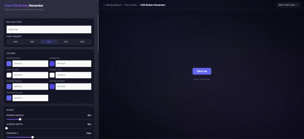
Try the free MockupShelf CSS Button Generator. You can customise button colours, text, borders, shadows, hover effects and animations using a visual editor.
It also lets you generate code in multiple formats, making it useful for different web development projects.
Frequently Asked Questions
Common questions about CSS button generators.
What are CSS button hover effects?
CSS button hover effects are visual changes applied to buttons when someone moves their mouse pointer over them. These changes can include colours, shadows, movement, borders and animations.
How do I add a hover effect to a button in CSS?
Use the :hover pseudo-class in your CSS. Add the styles you want inside the hover rule and use the transition property to make the changes smooth.
Can I create animated buttons using CSS only?
Yes. You can use CSS transitions, transforms, pseudo-elements and keyframe animations to create animated buttons without JavaScript.
Do CSS hover effects work on mobile devices?
Mobile devices don’t have traditional mouse hover interactions. Some browsers may simulate hover after a tap, but you should make sure buttons remain usable without hover effects.
Which CSS button hover effect is best?
It depends on your website design. Colour changes and subtle lift effects work well for business websites, while gradient, glow and animated effects can suit creative portfolios and gaming websites.
Can I generate CSS buttons without coding?
Yes. You can use an online CSS Button Generator to customise button styles visually and generate the required HTML and CSS code.
Note: MockupShelf.com is completely free to use, with no hidden charges or redirects. The site is supported by ads, so if you enjoy our resources, please consider disabling your ad blocker to help keep us alive.
Stay Updated
Get notified about new mockups, premium bundles, free resources, and product updates. No spam